How to build a modal component in React
Let's use React hook - useState to implement a simple modal.

A Modal is a separate window or pop-up positioned above the current page. This mostly happens as a result of the click of a button or so. They are usually used to display additional information.
If you're new to writing react, you can get carried away with the ease of installing libraries for every possible task. This in itself is not a bad idea since in many cases it saves you development time. But you want to be able to configure things without a lot of overhead which could be the case when installing some of these libraries. That is why in this guide you're going to build a modal with just plain ol' CSS and react hooks.
At the end of this tutorial, you will have a working modal that you can toggle on/off without installing any external libraries. This can be extracted into a reusable component for your other react projects. You will find in this guide a suitable use case to practice react hooks particularly useState and useRef.
Prerequisites
In order to follow this guide:
A basic understanding of HTML, CSS, JS
A basic understanding of React
Step 1 - Setup a new react project
After you start a new project, head over to your App.js. We will implement the modal here.
import { useState } from 'react'
import './App.css';

function App() {
  const [open, setOpen] = useState(false)

  const handleOpen = () => setOpen(true)

  const handleClose = () => setOpen(false)

  return (
    <div className="App">
      <h1>React Modal</h1>
      <button onClick={handleOpen}>Open Modal</button>
    </div>
  );
}

export default App;
So let's go over the following code step by step to see what's going on.
We've named our state variable open and we're setting it to the value of false by default. open is what keeps track of our toggle actions. When its value is set to true, the modal is displayed and when its value is set to false the modal is hidden.
The function handleOpen sets the state open to true using setOpen while handleClose does the exact opposite by setting the state to false, again, using setOpen from our useState hook.
Next up, we have the return part of the component comprising of a header element and a button. The button receives an onClick attribute to run the handleClose function when the button is clicked.
This way, a user clicks the button, it calls the handleOpen function which sets the value of open to true.
Step 2 - Create the Modal Component
The modal component should look something like this:
import React from "react";

const Modal = () => {
  return (
    <div>
      <h2>Look at me! I'm an open Modal</h2>
      <button className="button">Close</button>
    </div>
  );
};

export default Modal;
Nothing too fancy for now.
Before we do anything with our Modal component, head over to App.js and import it to our App. After that, pass the state open, and also handleOpen to it as props in order to be able to access it from within the Modal component.
import { useState } from 'react'
import './App.css';
import Modal from './components/Modal';

function App() {
  const [open, setOpen] = useState(false)

  const handleOpen = () => setOpen(true)

  const handleClose = () => setOpen(false)
  return (
    <div className="App">
      <h1>React Modal</h1>
      <button className="button">Open Modal</button>
      <Modal open={open} handleOpen={handleOpen}/>
    </div>
  );
}

export default App;
Back to our Modal Component.
const Modal = ({ handleClose, open }) => {
  return (
    <div className={`${open ? 'modal-container' : 'close'}`}>
      <div className="modal">
        <h2>Look at me! I'm an open Modal</h2>
        <button className="button" onClick={handleClose}>Close</button>
      </div>
    </div>
  );
};

export default Modal;
Here in the parent div, using a ternary operator, you selectively apply a different style based on the value of open. That simply means, that if the value of open is true we apply the modal-container class which opens the modal, and if not then we apply the close class which closes the modal.
You now pass an onClick attribute to the close button. When a user clicks on the button, it triggers the handleClose function whose job is to change the value of open to false. Once the value of open has been changed to false, the close class is applied to the parent div making the modal disappear.
Next up, we can now add our css classes to add a bit if styling to the page.
.App {
  padding: 1rem;
}

.modal {
  position: fixed;
  background-color: rgba(0, 0, 0, 0.6);
  top: 0;
  left: 0;
  width: 100%;
  height: 100%;
  display: block;
  padding: 1rem;
}

.modal {
  position: fixed;
  background: white;
  width: 50%;
  top: 50%;
  left: 50%;
  transform: translate(-50%,-50%);
  padding: 1rem;
  border-radius: 8px;
}

.close {
  display: none;
}

.button {
  padding: 8px;
  background-color: #4169e1;
  color: white;
  font-weight: 500;
  border: 1px solid #4169e1;
  border-radius: 4px;
  cursor: pointer;
}
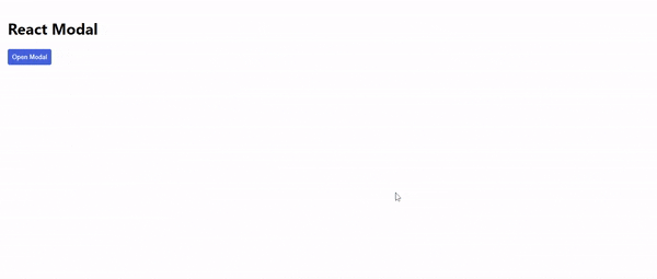
Now if you save all changes, go over to the browser, and refresh you should see the changes. The modal should look like the image below. You can see how it opens and closes. Pretty cool right?
Notice that our modal only closes when the close button is clicked. Suppose you want the modal to close when there is a click outside the modal area? For that, you'll make use of useRef and useEffect hooks.
Update your Modal.js to look like this:
import { useEffect, useRef } from "react";

const Modal = ({ handleClose, open, setOpen }) => {
  const ref = useRef();

  useEffect(() => {
    const handleOutsideClick = (e) => {
      if (open && ref.current && !ref.current.contains(e.target)) {
        handleClose();
      }
    };

    document.addEventListener("mousedown", handleOutsideClick);

    return () => {
      // Cleanup the event listener
      document.removeEventListener("mousedown", handleOutsideClick);
    };
  }, [open, handleClose]);
  return (
    <div className={`${open ? 'modal-container' : 'close'}`}>
      <div ref={ref} className='modal'>
        <h2>Look at me! I'm an open Modal</h2>
        <button className='button' onClick={handleClose}>
          Close
        </button>
      </div>
    </div>
  );
};

export default Modal;
Within the function handleOutsideClick we check to see if the modal is open and if the click occurs outside that area. If the above is true, we call the handleClose function that closes the modal. Meanwhile, within the useEffect, we're listening for a mousedown event.
Next, we pass the ref attribute to the div with the class of modal. Now save and head over to your browser to see the changes. The modal closes by clicking around it.
Conclusion
In this guide, you learned how to implement modals in React with the instrumentality of hooks and conditional rendering.
You can find the entire code for this project here.
To view a demo of the project on codesandbox, find it here


